
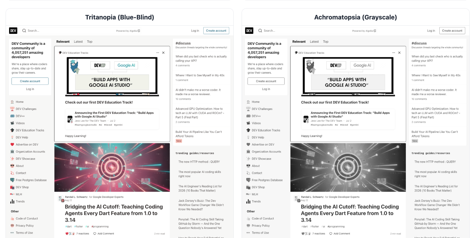
When running automated accessibility evaluations across thousands of pages, the default output is usually a heavy-duty wall of technical data.
Code-level WCAG violation logs and JSON payloads are incredibly powerful for engineering teams. But here is the hard truth: Raw data does not build empathy.
When presenting accessibility debt to product managers, designers, or stakeholders, I found that an abstract list of technical failures wasn’t enough to drive action. So, alongside the heavy-duty code scanners in my pipeline, I recently integrated a suite of “delight and surprise” artifacts.
Instead of just handing over a list of bugs, the pipeline now automatically generates visual, experiential reports that stakeholders can actually feel:
Visual Tab Maps#
Using html2canvas, the analyzer draws the exact, sequential keyboard focus order directly over a page screenshot. Suddenly, a “WCAG 2.4.3 Focus Order” failure isn’t just a spreadsheet row—it’s a tangled, chaotic web of lines that everyone can see is broken.
Screenreader#
Transcripts: Leveraging @guidepup/virtual-screen-reader, the pipeline outputs a linearized text script of exactly what an assistive tech user hears. Reading a confusing, broken transcript builds immediate empathy in a way a DOM snippet never could.
Colorblindness Emulation#
Using Playwright CDP commands, the tool generates full-page Protanopia, Deuteranopia, Tritanopia, and Achromatopsia visual simulations.
Contrast Callouts#
Powered by contrastcheck, the dashboard isolates and visually highlights the exact text and background color pairs failing the mathematical ratios.
Data and code scanners find the debt, but visual artifacts sell the fix. When a team can literally see the barrier, remediation suddenly becomes a priority.
What visual tools or artifacts do you use to bridge the gap between technical accessibility bugs and stakeholder empathy?
Explore the features#
Vists the systemic accessibility analyzer dashboard, to see the results of these tools.